Overview
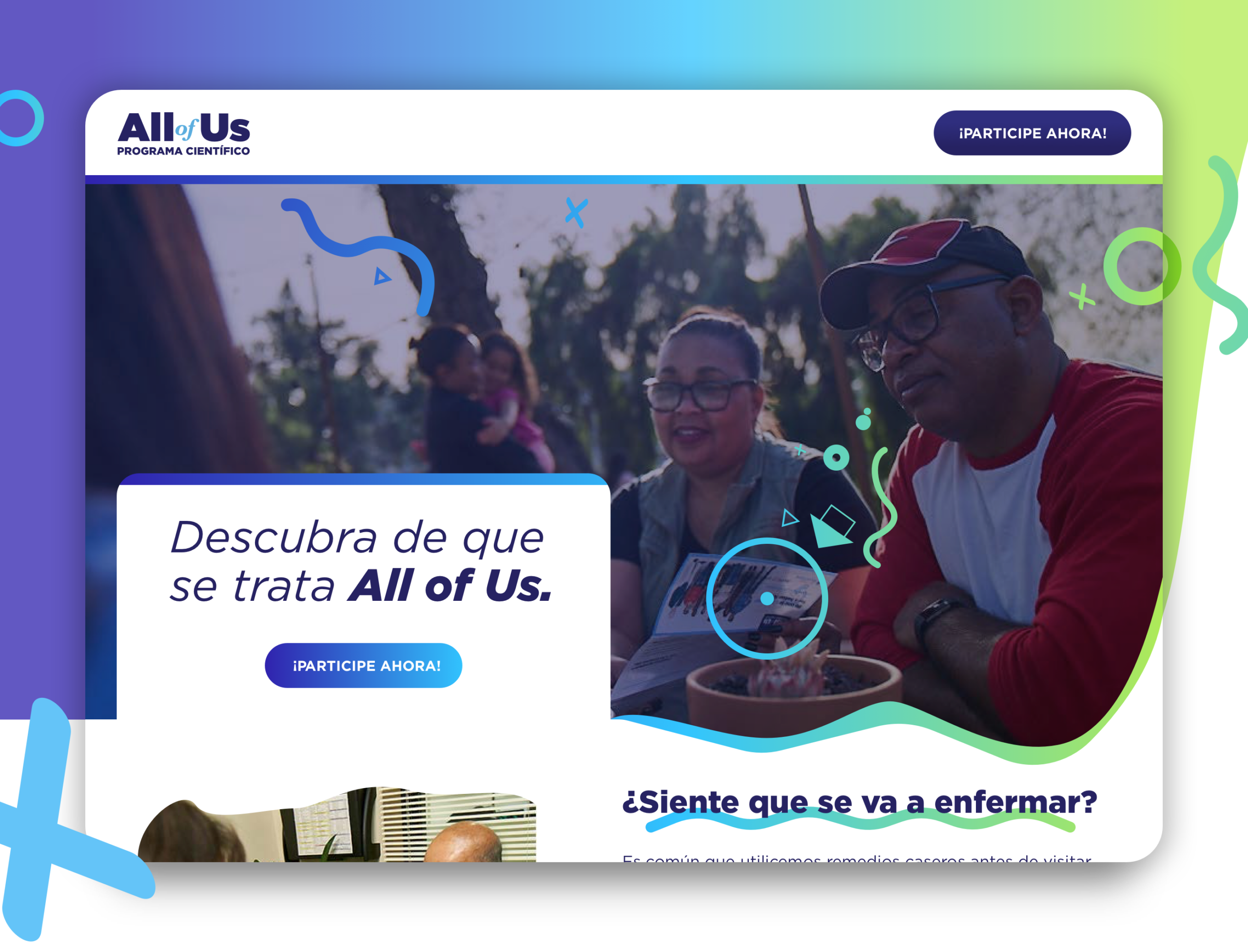
NIH's All of Us Research Program is one of the most ambitious precision medicine initiatives in US history — aiming to build a diverse health database of 1 million or more participants. Scripps Research Institute served as one of the program's regional enrollment hubs, and my role was to design the participant-facing enrollment experience with a sharp focus on inclusivity, trust, and bilingual accessibility for English and Spanish-speaking communities.
The core design challenge wasn't just usability — it was earning trust. Many participants, particularly within Latino communities, had valid reasons for wariness around medical data sharing. Every screen, every word, every interaction pattern needed to reduce anxiety, build confidence, and guide participants through a complex consent process without them feeling surveilled, overwhelmed, or excluded.

The Problem
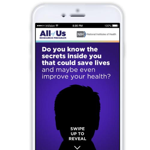
The existing enrollment flow had been designed primarily in English, with Spanish as an afterthought — translated text dropped into English-first layouts that often broke, truncated, or lost cultural nuance. The consent documentation was written at a 12th-grade reading level, riddled with medical and legal terminology that created friction and drop-off during the enrollment process.
Additionally, the enrollment journey spanned multiple touchpoints — an initial screening on mobile, a more detailed consent step on a kiosk in-clinic, and follow-up actions via email. There was no coherent cross-device handoff, resulting in participants losing progress and having to restart. Dropout rates at the consent phase were significant, and they skewed disproportionately toward the exact communities the program most needed to include.
Research & Approach
I partnered with the Scripps community health team to conduct contextual research with participants across their outreach programs — community health fairs, church partnerships, and clinic waiting rooms. This gave me direct exposure to how real people encountered the enrollment experience in its actual environment, not a lab setting.
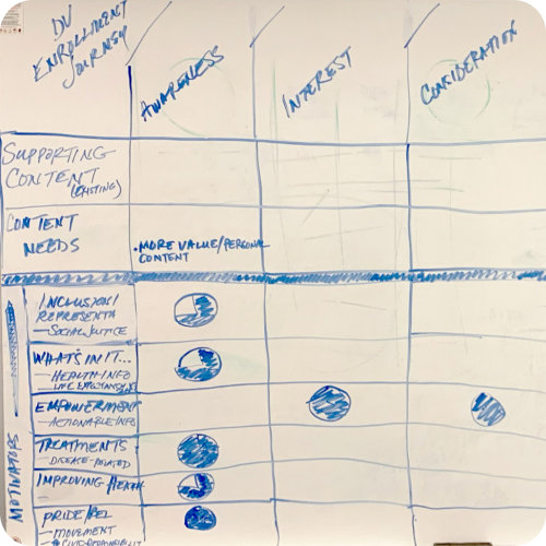
Key findings: participants wanted to know why before they would engage with how. The consent flow needed to lead with purpose and benefit, not with legal boilerplate. For bilingual participants, switching languages mid-session was a major source of confusion — the experience needed true first-class Spanish support, not a translation toggle.
I also worked closely with health literacy specialists to rewrite consent content at a 6th-grade reading level in both languages — plain language, short sentences, visual icons to reinforce meaning. This was as much a content design project as a UX design project.
Design System & Execution
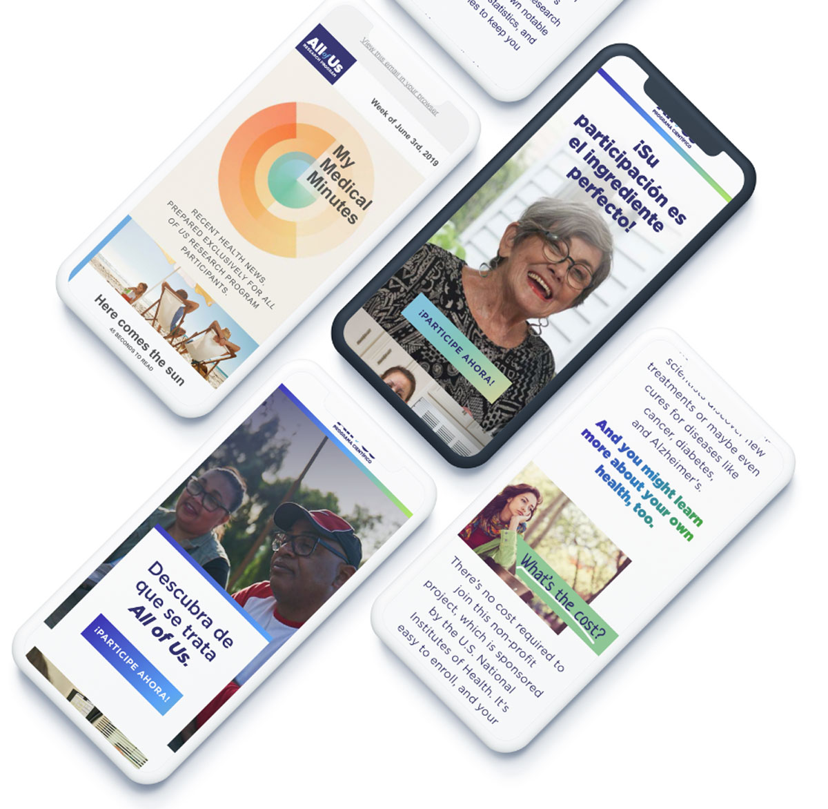
The redesigned enrollment flow was built on a component system designed for clarity and trust: high-contrast typography, generous white space, progress indicators that felt encouraging rather than daunting, and photography featuring real, diverse participants (not stock-photo diversity). Every color decision, icon choice, and interaction pattern was made in service of reducing cognitive load for participants who were often making this decision in a waiting room or at a community event.
The bilingual system was architected so that language preference, set at the start, was preserved across all touchpoints — mobile, kiosk, and email follow-ups — with no loss of state. Spanish-language screens were laid out independently rather than transposed from English, accommodating longer text without layout breaks or truncation.
For the in-clinic kiosk experience, I designed a large-format touch interface optimized for low-tech users — gesture-free navigation options, large touch targets, and a "help" mode that triggered a simplified audio description of each consent step for participants with reading difficulties.
Key Outcomes
↑ Sig.
Measurable increase in Latino community enrollment at the Scripps site
6th
Grade reading level — consent content redesigned from 12th grade baseline
2
Languages — true first-class English + Spanish, not a translation afterthought
3
Touchpoints unified — mobile screening, in-clinic kiosk, email follow-up