Overview
GenPhase AI is an AI consultancy helping businesses implement intelligent automation across their operations — from document processing and customer service automation to predictive analytics and internal workflow optimization. When they came to me, they had the technical capability and the clients, but no coherent brand, no website that communicated their value clearly, and internal processes that were slowing down their ability to deliver at scale.
The engagement was comprehensive: build the brand identity from nothing, design a website that could convert sophisticated B2B buyers, map and optimize their client onboarding and delivery workflows, and establish a product UX framework for the AI tools they were building for clients. This was one of those rare projects where the design work touched every dimension of the business simultaneously.

Brand Identity
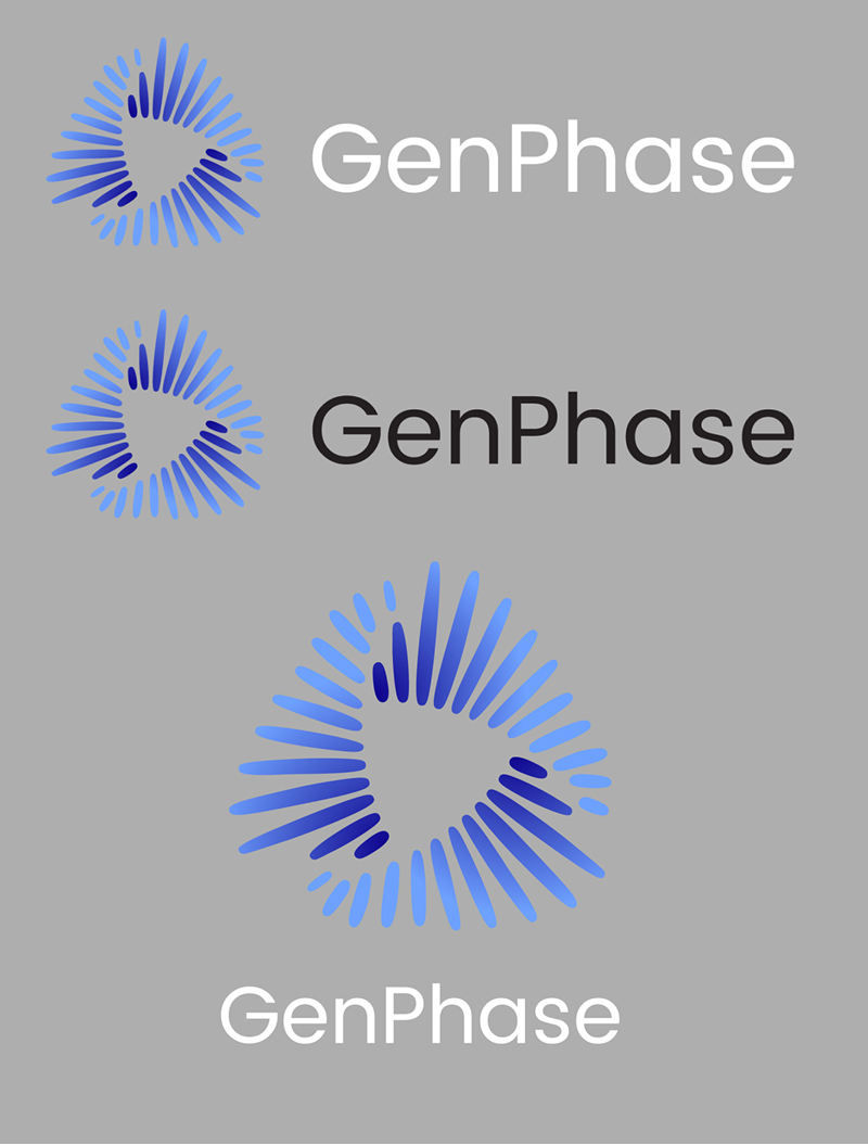
The AI consulting space is crowded with brands that lean on the same visual clichés — neural network graphics, glowing blue circuits, abstract data streams. GenPhase needed a brand that felt authoritative and premium without being generic. The strategy was to position them as a strategic partner, not a vendor — the design language needed to communicate sophistication, precision, and trustworthiness to enterprise decision-makers.
I developed a brand identity system built around the concept of "phase" — transformation, transition, and the structured movement from one state to another. The mark I created is geometric and precise, reflecting the methodical nature of AI implementation work. The color system uses a deep midnight palette as the primary brand expression with a single bold accent — warm, not cold — to differentiate from the sea of blue-heavy AI brands. Typography follows a high-contrast pairing: a strong display face for headlines with a clean, highly legible sans-serif for body and UI.
The brand system was delivered as a comprehensive Figma library with tokens, component variants, logo lockup rules, and application examples across digital and print — built to be handed off and maintained without me in the loop.
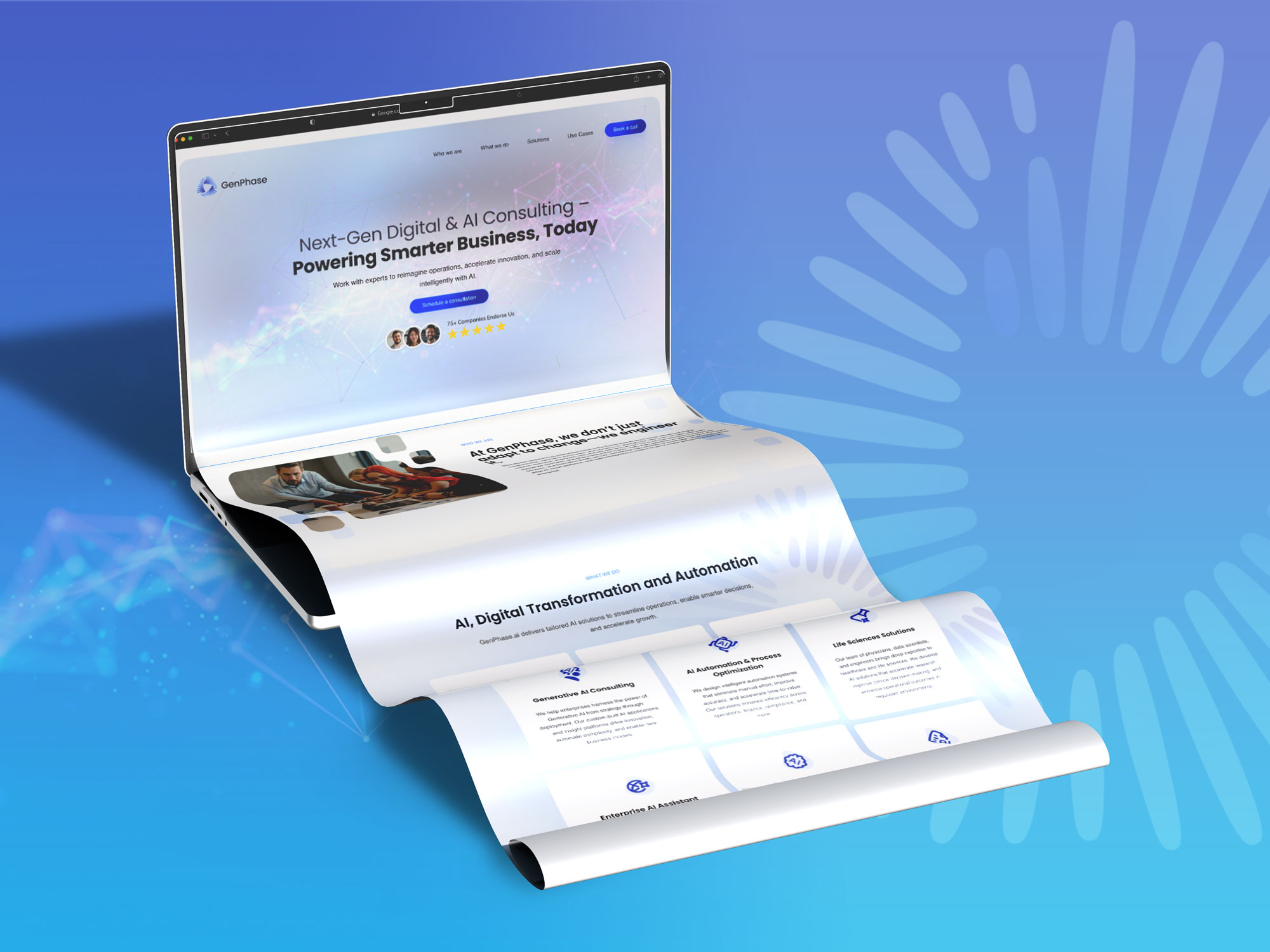
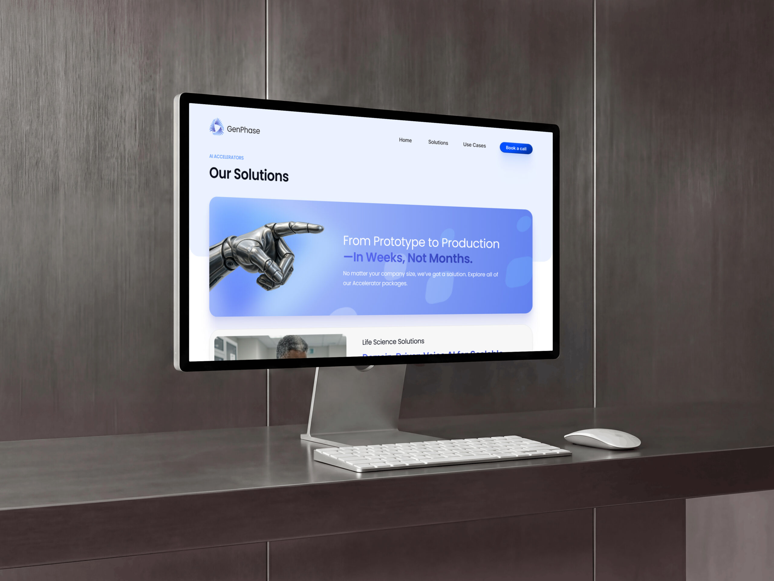
Website Design
The website needed to do heavy lifting: establish credibility immediately, communicate what GenPhase does without requiring the visitor to be an AI expert, and convert enterprise buyers who would arrive from referrals or LinkedIn — skeptical, time-pressed, and evaluating three to five competitors simultaneously.
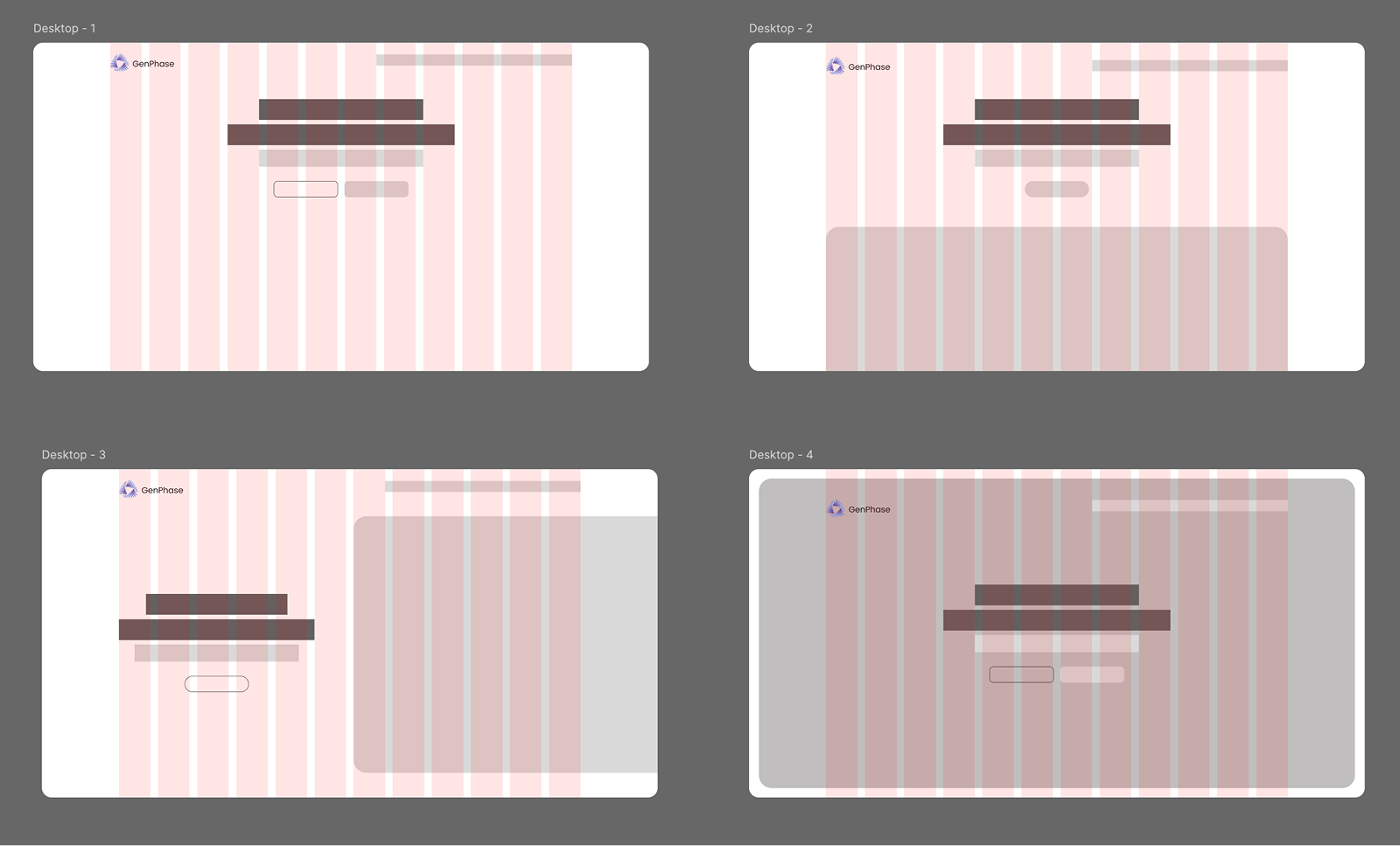
I designed the site architecture around a clarity-first principle: every page answers one question, and that question is always the question the visitor has at that stage of their evaluation. The homepage answers "are you credible and relevant to my problem?" The services pages answer "exactly what do you do and how does it work?" The case studies answer "have you done this before and did it work?" The contact flow answers "how easy is it to take the next step?"
The visual execution was built in Wordpress, allowing for the kind of animated, interactive storytelling that the brand required — process diagrams that animate on scroll, statistics that count up on entry, a before/after workflow visualization that made the product's value tangible without requiring a sales call. The site was built modular so the GenPhase team could update content independently.
Business Workflow Optimization
Beyond the brand and website, GenPhase had a deeper operational problem: their client delivery process was ad hoc. Project kickoffs, requirements gathering, deliverable reviews, and client reporting were happening in different tools with no consistent structure — creating inconsistent experiences for clients and high coordination overhead for the GenPhase team.
I ran a two-week workflow audit: mapping their existing delivery process end-to-end in FigJam, identifying the friction points (unclear handoffs, manual status tracking, repeated back-and-forth on scope), and designing a standardized delivery framework. This included intake form templates, project kickoff decks, milestone review formats, and a lightweight client-facing status portal mockup — all documented and designed in a way that the team could implement with minimal tooling change.
The product flow work — designing the UX for AI tools GenPhase was building for clients — meant creating interaction patterns and UI standards for AI-assisted interfaces: how to present AI outputs with appropriate confidence indicators, how to design review-and-approve flows for AI-generated content, and how to design for the "hand back to human" moments that are critical in responsible AI product design.

Key Outcomes
0→1
Brand built from nothing — logo, system, tokens, component library
Full
Site designed and built in Wordpress — modular, editable by the GenPhase team
↓ Ops
Delivery workflow standardized — reduced coordination overhead across projects
AI UX
Product flow framework for AI interfaces — confidence, review, and human-handoff patterns